Our Balcony Design (Small Outdoor Space Inspo!)
We’ve now lived in like… five places together (six if you count our three-month trek across America in our camper Rosie) and in all that time we’ve gotten to decorate so many different spaces. But we’ve never really had a solid outdoor hangout spot to design, so when we moved into this apartment just about six months ago, I was pretty determined to make something really cute happen with the balcony. I wanted to make sure it wasn’t just a bare place where I leave my muddy cleats to dry until Beau yells at me, but a real extension of our living space where we could do all our same boring homebody activities, but outside. So we’re doing that!
As far as the style we’re going for, we knew we wanted something that felt lived-in and eclectic. Beau and I definitely have different taste, but we’ve come to recognize a commonality and middle ground that happens whenever we design a space together. Where Beau’s purest taste is clean and modern with pops of loud color, mine tends to be more mindfully cluttered but with cooler or neutral tones. We tend to meet in the middle with something like a “Jungalow-inspired mid-mod-tiki-leaning with pops of white” aesthetic. Working on a better name for that currently.
The inside of our apartment leans slightly more neutral than we usually go, so we knew going into designing the balcony that we wanted it to be more playful and colorful when compared to the rest of the house. Especially with this more colorful bohemian style, we like to approach our home design with balance in mind by intentionally keeping parts of the house a bit more bare to help further accentuate the parts of our home that are a bit louder. Just as you want some pieces to be accents with other pieces forming a less attention-grabbing foundation, the rooms of a house shouldn’t be fighting each other for attention either. We aim for definite accent areas that garner more attention than the rest. So we decided the balcony was going to be one of those accent areas.
Before Photos
Well… there’s not much to say. This was an untouched & brand new apartment balcony that doesn’t have any character at all. One thing I love about the space is that it looks out to a forested area behind our building, and other than that there’s not much to write home about. That’s sort of been the story with most of the rooms in our apartment—there’s just not a lot of character, which I guess comes with the territory of it being in a new construction apartment complex. Considering our last home was a 100 year old home in a historic New Orleans neighborhood, we had our work cut out for us for how to give this space some oomf!
The Moodboard
As we pretty much always do when planning a space, we made a mood board. We make these by browsing products and images online and arranging them in Photoshop to see how they would look together. There are also a lot of apps to help do this, but we’re most comfortable with good old trusty Photoshop. When you’re planning on shopping for a piece secondhand, or already have a piece that you plan to use, you can still include it in the moodboard—just do an image search for something similar to stand in for that item—like I did here for “wicker pendant” because we’d already bought one vintage. (We always prefer to buy vintage when we can—it’s so much more environmentally friendly than buying new, and you can be pretty confident that very few people will have the same piece).
The biggest thing to figure out here wasn’t any of the individual pieces, but the furniture layout. The easy and obvious layout would have been a centered bistro table with two dining chairs. Beau really fought me on this for a while, but as you can see from the moodboard I felt like pushing the chairs back to the walls and going with a coffee table instead of a dining table was going to give us a lot more breathing room and ultimately make it a much more relaxing space. Now that it’s done I think he agrees. Or he’s just lying to me, which is honestly fine.
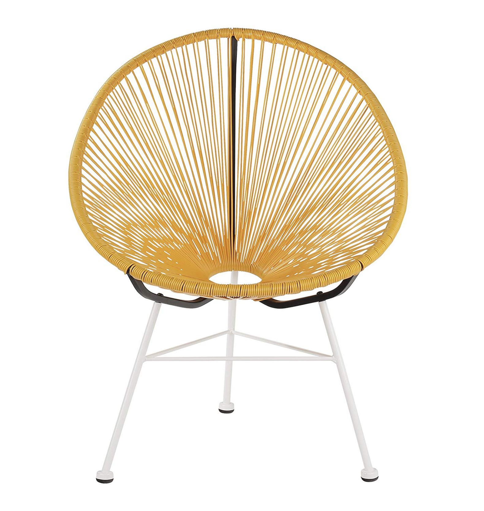
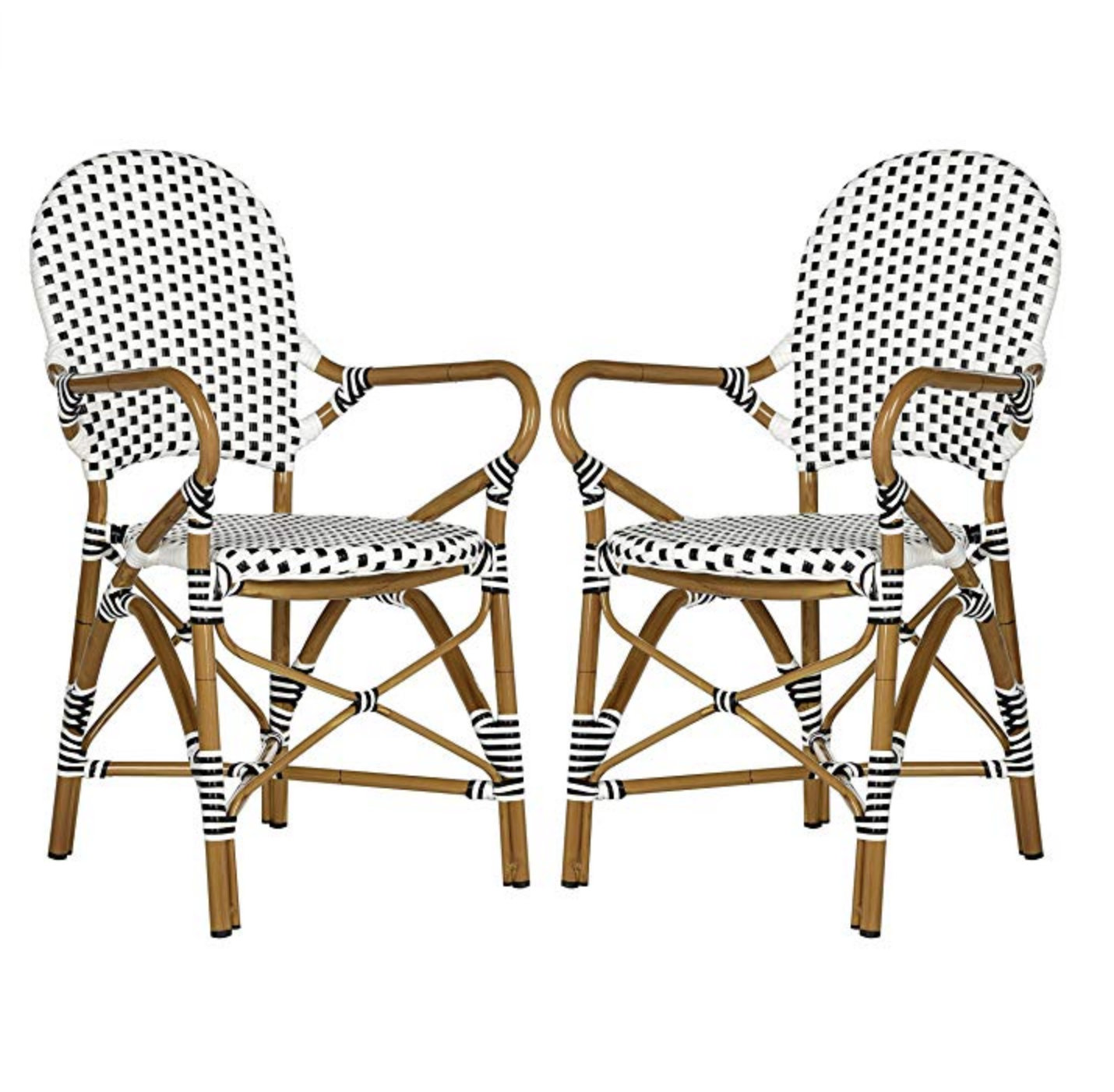
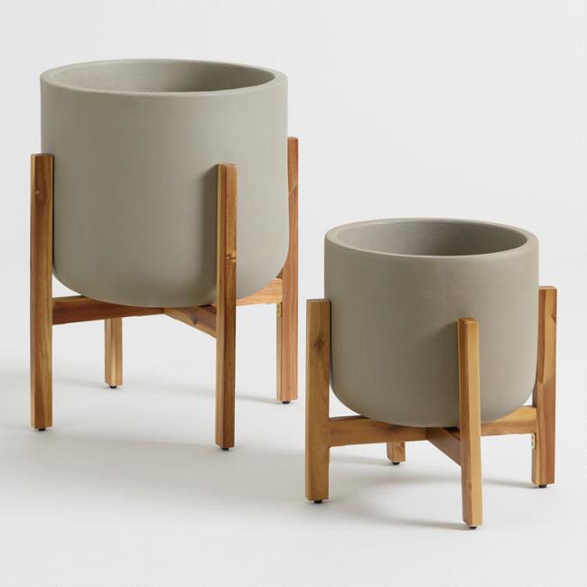
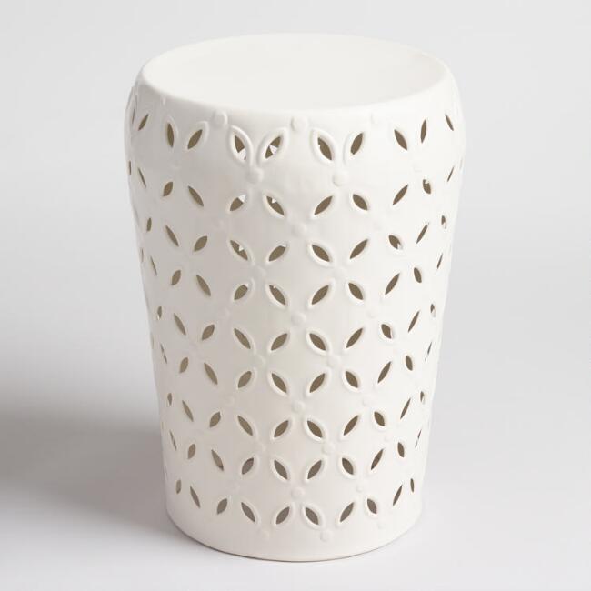
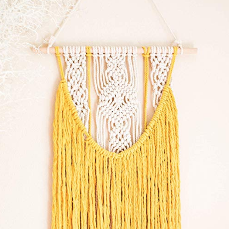
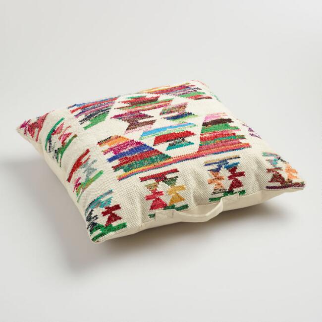
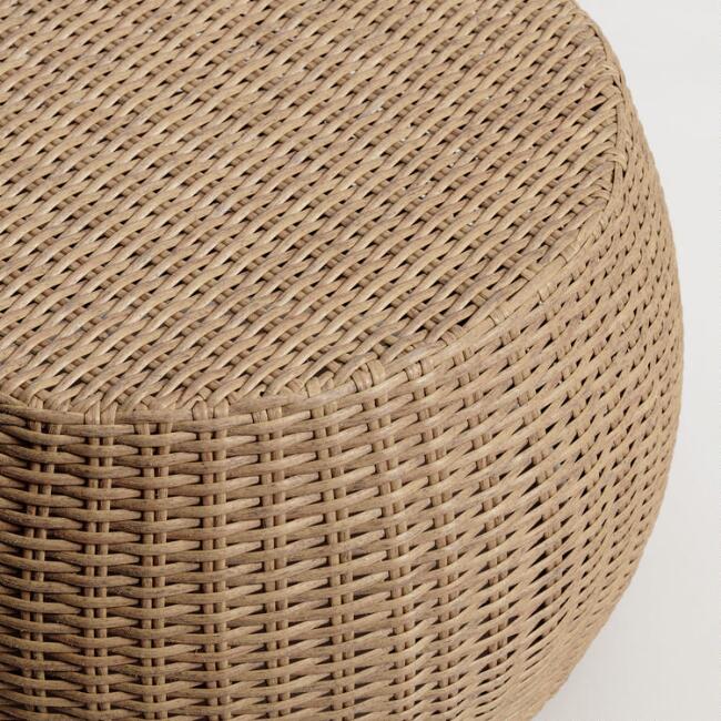
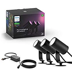
Products Shopping List
click on the image for direct links!
After
psst… if you want to learn how we did our hanging herb garden, check out our blush floating planters DIY. <3
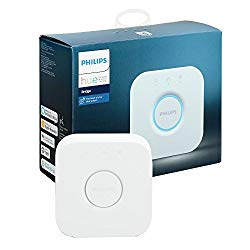
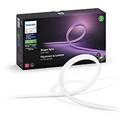
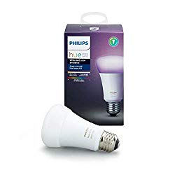
We’ve got plants! We’ve got wicker! We’ve got lights! We’ve got herbs! We’re drinking stevia lemonade and reading books, momma! We were able to stick pretty closely to the moodboard and the colors came together beautifully. And the lights? My god. We have three spotlight stakes that sit in each of our three big pots, plus a light strip and light bulb for the wicker pendant all from Phillips Hue.
It really feels like our own personal cozy outdoor corner, with gorgeous lighting and swaying palms and a view of the forest. And very few humans can even see us up here! It’s like a little tree house. We’ve spent a few evenings out there just reading books and enjoying the weather, and I’m a big big fan. I’m so looking forward to summer evenings and tiki cocktails in the new space ;)
XOXO
Matt (& Beau)


