Making The Cottage Stairs
Our vision for the Chanterelle Cottage—the guest home on our property in East Tennessee that is this close to being ready as a vacation rental—was to bring old-school charm into a home that is basically a brand-new build.
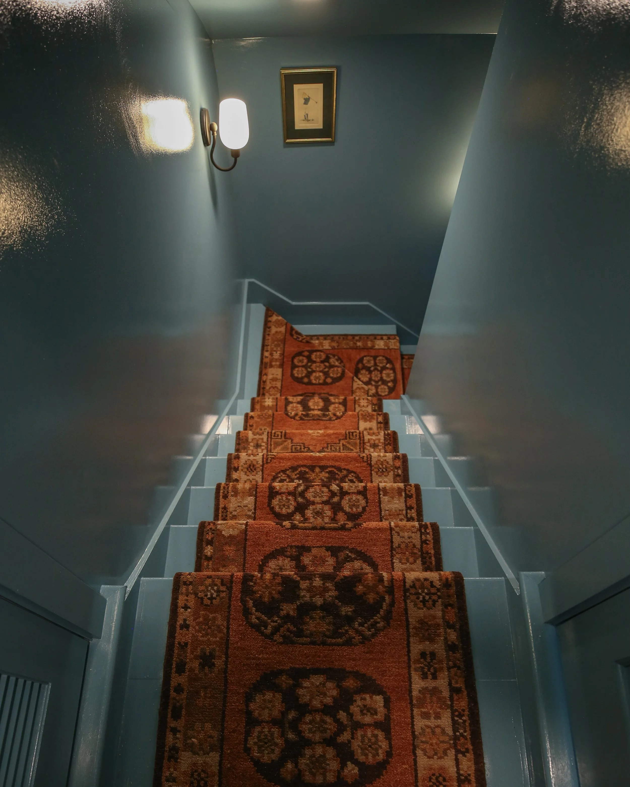
When it was time to design the stairs that lead from the living room into the tiny attic bedroom, we knew it would be a great spot to bring in some tasteful drama and colorful opulence. As part of my mission for old-school charm, I knew I wanted a runner on the stairs that borrowed from the colors and patterns of vintage Persian rugs. And what better way to bring home the drama than color drenching the walls, stairs, and ceiling?
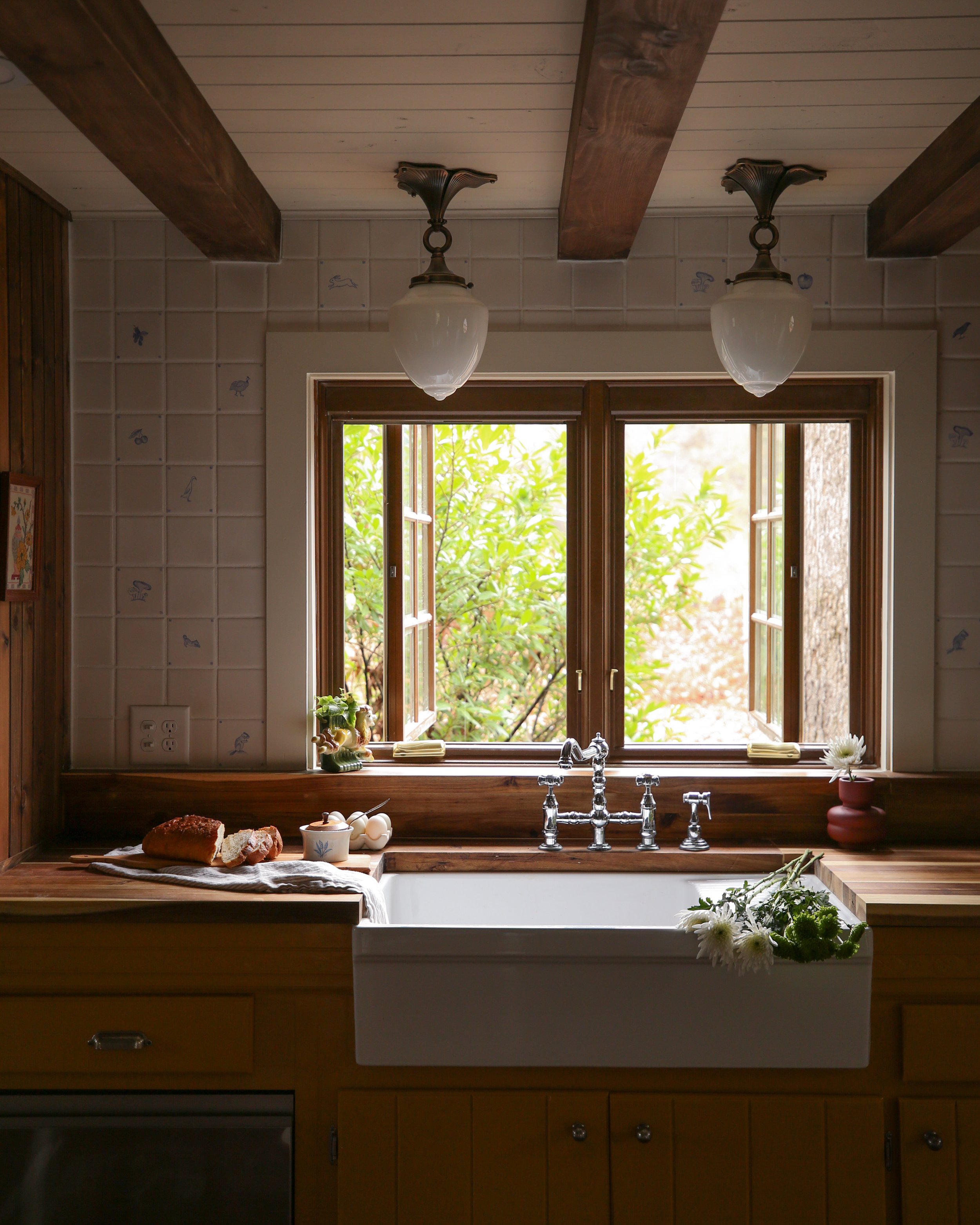
I originally considered going a mustard or ochre route for the color. After all, the name of the cottage is the chanterelle cottage, and a nod to the color of chanterelles sounded appropriate. But we decided to go yellow for the kitchen cabinets, and I didn’t want to overdo it, for fear of the home feeling themed. Nightmare.
Occasionally, when I’m stumped on color direction, I go to Farrow & Ball’s website for inspiration. I’m always really impressed by how designers and decorators apply the gorgeous hues F & B offers, and you can see so many different applications and inspiration on their site. There, I scrolled across Stone Blue for the first time, a warm and rich color that somehow feels equal parts saturated and subdued.
I was in love.
p.s. if you want links to products used in this project, scroll to the bottom of this post!
I’ve long struggled with blue paint selection, often feeling they lean too overwhelming or too gray. Neither option makes me happy. As a result, it’s rare to see a shade of blue in any of my designs.
But Stone Blue? Stone Blue is a color that has balance. Its saturated high notes are grounded in the gray stoniness of its base. It feels eager but confident. I love that.
For the finish, I chose to go full gloss to mimic the oil paint used in older homes, not to mention it makes the walls pretty much scuff-resistant, which will be great for upkeep in a staircase that will see a lot of use.
Strike a pose, king.
Once we’d chosen blue for the paint color, I knew the runner needed red as its primary color in order to create the most visual contrast and, therefore, help guide folks on their journey up the stairs. With so much of the space being monochromatic blue, I needed something to break it up for visual beauty and functional ease of use.
The Noah Hand Knotted runner from Rejuvenation was a great fit for this, and even though the color of it definitely leans more burnt orange than red, I think it really does the trick nicely.
For installation, I have to hand it up entirely to Matt. Installing a runner rug on a stairwell isn’t terribly complicated, but the turn in the stairs made it treacherous. For now, I’m going to link to this blog post we used as a starting point to figure out the basic install, and hopefully, in the future, we will have our own post that accounts for dealing with more challenging stairs, as well as what to look for in a runner rug when preparing to do a project like this.
Find the products we used below and as always feel free to comment, message, or email if you have any questions!
xoxo
Beau
The noah Hand Knotted Runner
Click through on the image to shop.
The Connor Wall Sconce
Click through on the image to shop.
Acorn Finial Stair Rod
Click through on the image to shop.
You Might Also Like


![The Best Hudson Valley Cottage Stay [Upstate New York Travel]](https://images.squarespace-cdn.com/content/v1/5451b54de4b0d0c075728ccb/1690378254614-DFO3V1TFOY571DIHUNRL/hudson+valley+trip+cottage-4.jpg)


