Making Housewarming: Part 7, The Artwork
Hello! Welcome to “Making Housewarming,” our series on this here blog about how we created our debut book from start to finish—everything from how we decided what we wanted to create to organizing photoshoots to finding the right publisher and a whole lot more. We’ll be covering a different part of the process every week for ten weeks (this is week seven!), so make sure to check back in or join our weekly newsletter so you don’t miss anything!
Scroll to the very bottom of this post where you’ll find each post in the series and catch yourself up to speed. Or don’t! I’m not your mom!

When we first told everyone (everyone = all the big players who made this book happen, from our lit agent to our editor to our best friends) that we wanted this book to be filled with illustrations, the reaction wasn’t, like, amazing. I think mostly people were just unsure of how they’d fit in, why they were necessary, and hadn’t really seen a book in the “home” category feature illustrations as heavily as we wanted ours to. There were concerns it may feel a bit childish, or random, or may just distract from the contents of the book. All of which were fair concerns to have and things we were working through ourselves when we first decided we wanted this book to have illustrations.
But here’s the deal: we’ve gone through plenty of books in a similar category to ours, and while the photos may be gorgeous and the words are usually fine if not great, the pages themselves can sometimes feel a little sterile, or, to be more accurate, lack whimsy and inspiration. In a book that is all about making your home perfect for you and ready to welcome in your favorite people, whimsy and inspiration were going to be absolutely key to meeting our goals.
So the plan was to use illustrations throughout the book to meet three specific needs.
The first, to fill out and, well, illustrate the stories we tell from our past homes and life events that we didn’t have photos of, in a storybook kind of way. This book is a lot more than a guidebook, it’s full of stories and anecdotes and tales of our successes and failures. And we wanted to tell those stories with visual representation, and illustrations do that so well!
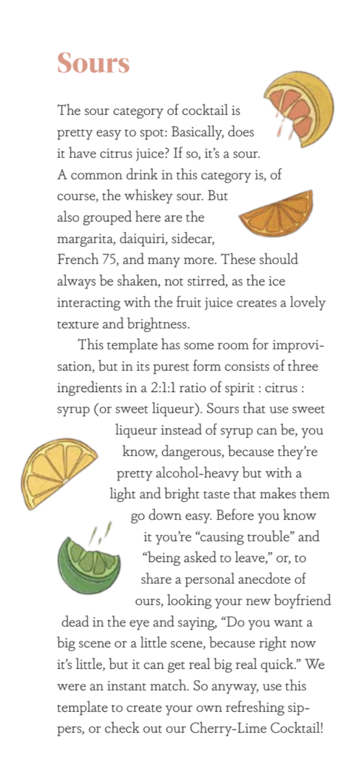
The second was to add splashes of excitement to the pages, or “whimsy” as mentioned above. This book is geared towards audiences of all ages and backgrounds, and not everyone wants to sit and flip through page after page of home design and projects and recipes without a little something to oooh and aaah at. The illustrations add that extra something to keep you, the reader, excited and engaged. In the intro to wine chapter, for instance, we do get a tiny bit technical and we’re totally aware how quickly that can make your eyes glaze over, so we have relevant illustrations alongside certain wine categories of wine bottles doing human things, like taking baths and drinking glasses of themselves. Because even though there are tons of gorgeous photos and we think our writing isn’t half bad, sometimes you just need that extra little something.
And finally, the third way illustrations are used is to, quite simply put, make it pretty. Each section opener has an illustrated pattern compiled of artwork referencing topics covered within that section. The art itself is fantastic and so well done, and we wanted it to make this book really stand out as a piece of art itself.
Which brings me to our illustrator and the process of actually making this all come together!
We found our illustrator, Stephanie Singleton, through an incredible website / database called Women Who Draw (www.womenwhodraw.com), which calls itself “an open directory to female illustrators.” When we first decided we wanted illustrations, we had no clue where to turn. A quick google search led us to this website and we were able to peruse a ton of artwork from so many amazing illustrators. We were like “oh this is how you find someone to illustrate a book, got it.”
There are so many styles of illustration out there, but we had a pretty specific idea of what we wanted. Illustrations that felt more “real” than “cartoonish,” with exciting—but not oversaturated—colors, and in the goldilocks zone between abstract and life-like. We felt that those characteristics would give us that whimsy we were craving without feeling childish, and would also be realistic enough to help illustrate certain points throughout the book when necessary.
When we found Stephanie’s work we were enamored immediately and pretty much knew at that very moment that we wanted her to do the book. We’d never done any of this before so we weren’t sure if we were going about it the right way or if we looked like complete morons with a half-baked idea for how the book would incorporate her illustrations—we only had about half of the concrete ideas for the actual illustrations fleshed out when we first approached her.
Well turns out Stephanie is very talented and helpful, and didn’t think we were stupid for being new to all of this, or at least didn’t say so! She talked us through her process, was able to help us flesh out our ideas, and was very patient while we figured out exactly what we wanted.
Some of the illustrations came to be just by us saying “we want artwork of (insert item)” while others started with a rough-terrible-horrible sketch by us, that she then took and made a sketch of. Once sketches were done it was time to pick colors, which was sometimes very easy and sometimes very hard (“the green should be minty but not too minty to where it’s like neon, but still warm, not cool-hued”).
We were lucky to have Stephanie guiding us the whole time and once everything was done, the design team at Abrams placed each piece exactly where we wanted in the book’s layout!
Below is a look at how one piece of art came to be, from start to finish.

Step 1: we draw a terribly ugly sketch of what we want and ind of how we imagine it being placed to give Stephanie a starting point.
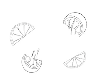
Step 2: Stephanie takes our drawing, probably laughs at it, and makes a gorgeous sketch based off of it. She sends it over to us for review before moving onto color.

Step 3: The art gets colored in! We talk back and forth about specific hues and tones and figure out what is right for each piece.
Step 4: The art is finalized and the design team works with us to find the best placement on the page!
And so that was the process for all of the dozens of illustrations throughout the book! It was a lengthy process that involved a ton of collaboration, but in the end it was all so worth it and created such a gorgeous book we can’t wait to share with you. We hope you’ll join in and follow along as we count down the weeks to our book’s publication! You can subscribe to our weekly newsletter to make sure you don’t miss a thing, and preorder Housewarming if you haven’t already! Below you’ll find all of the previous posts in this series, ready for your viewing :)


