Design Duel: Modern Victorian Living Room & Office Reveal
Design Duel: Modern Victorian Living Room & Office Reveal
This post is in partnership with Sherwin-Williams®, as always all opinions are our own.
For the past two months we’ve been engaged in a heated design duel to get the front two rooms of our house looking sharp. Because we are both VERY serious competitors, first things first was setting some ground rules! Beau is tackling the living room, and Matt is tackling the office. The two rooms are mirror images of one another—same square footage, window layout, and both even have a front door. Now we’ve got the two rooms connected to each other via two sets of French doors on either side of the shared fireplace, which is the final piece that makes them the perfect place for a design duel. A very serious and high-stakes design duel that could end in… drama? We’ll see!
The Design Duel Rules!!
The details of the room designs were up to us, but to keep it cohesive between the spaces, the design direction is modern Victorian.
At least one part of each room should be a DIY that our online fam (that’s you!) can do themselves.
We’d each need to pick a f-a-b-u-l-o-u-s color from Sherwin-Williams huge color selection.
Unsolicited advice from each other is allowed, but not welcome.
We each had one veto for the other’s room, in case anything got out of hand.
So with all that in mind… let’s dive in and decide who won, yeah?
Living Room: Before & Design Plan
LIVING ROOM BEFORE!
from Beau
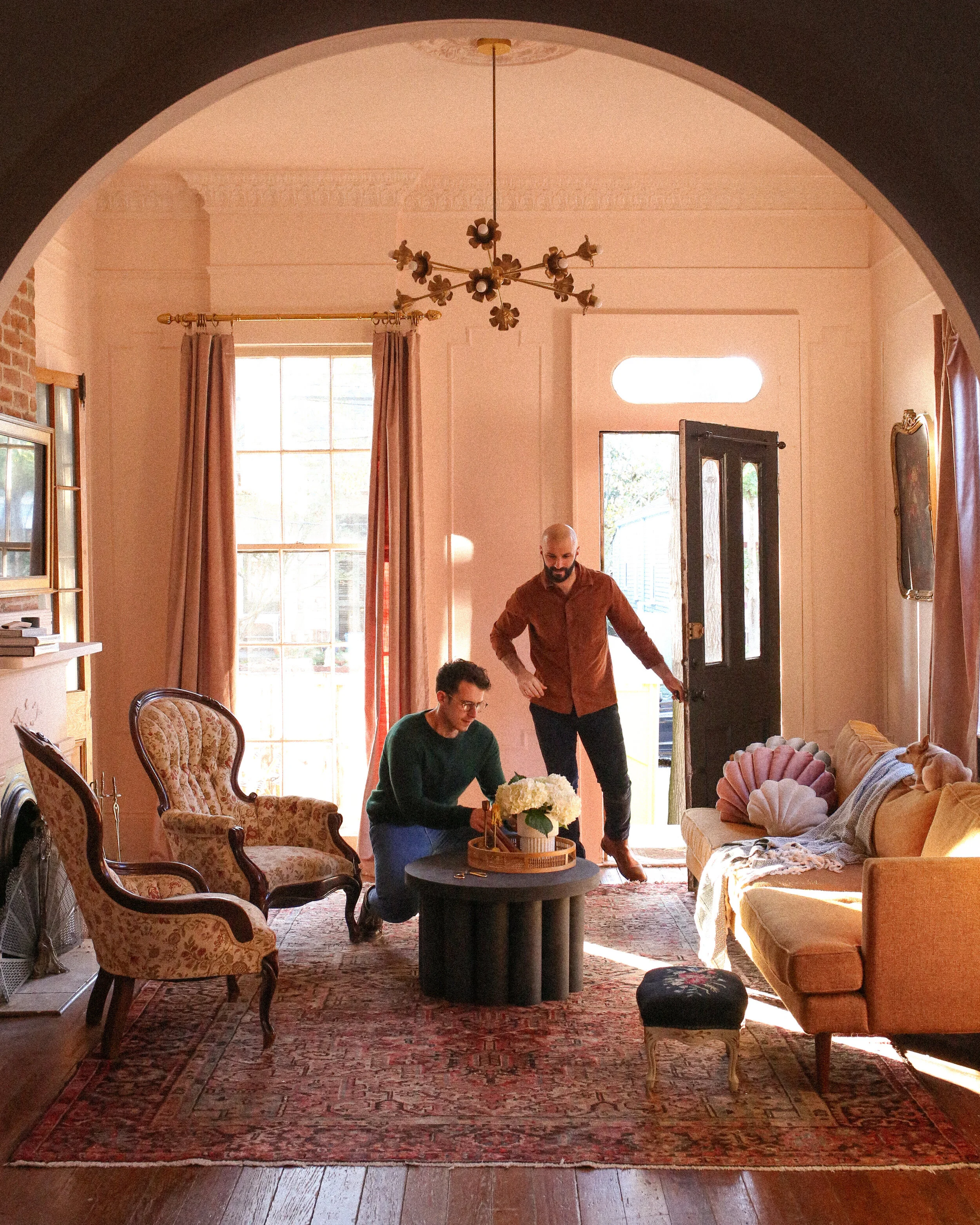
I had a few things to consider when planning the living room. First and foremost, it’s not just a living room––it’s also where we enter our home. I wanted to create a living room that was airy enough to be a point of passage through the home, comfortable enough to make you want to stay, stunning enough to be a wow factor upon arrival, but neutral enough to not compete with the two areas of discovery that this room leads to: the stately office Matt has created and the (eventually) emerald green kitchen that we’ll be tackling in 2021. So I had a lot on my mind.
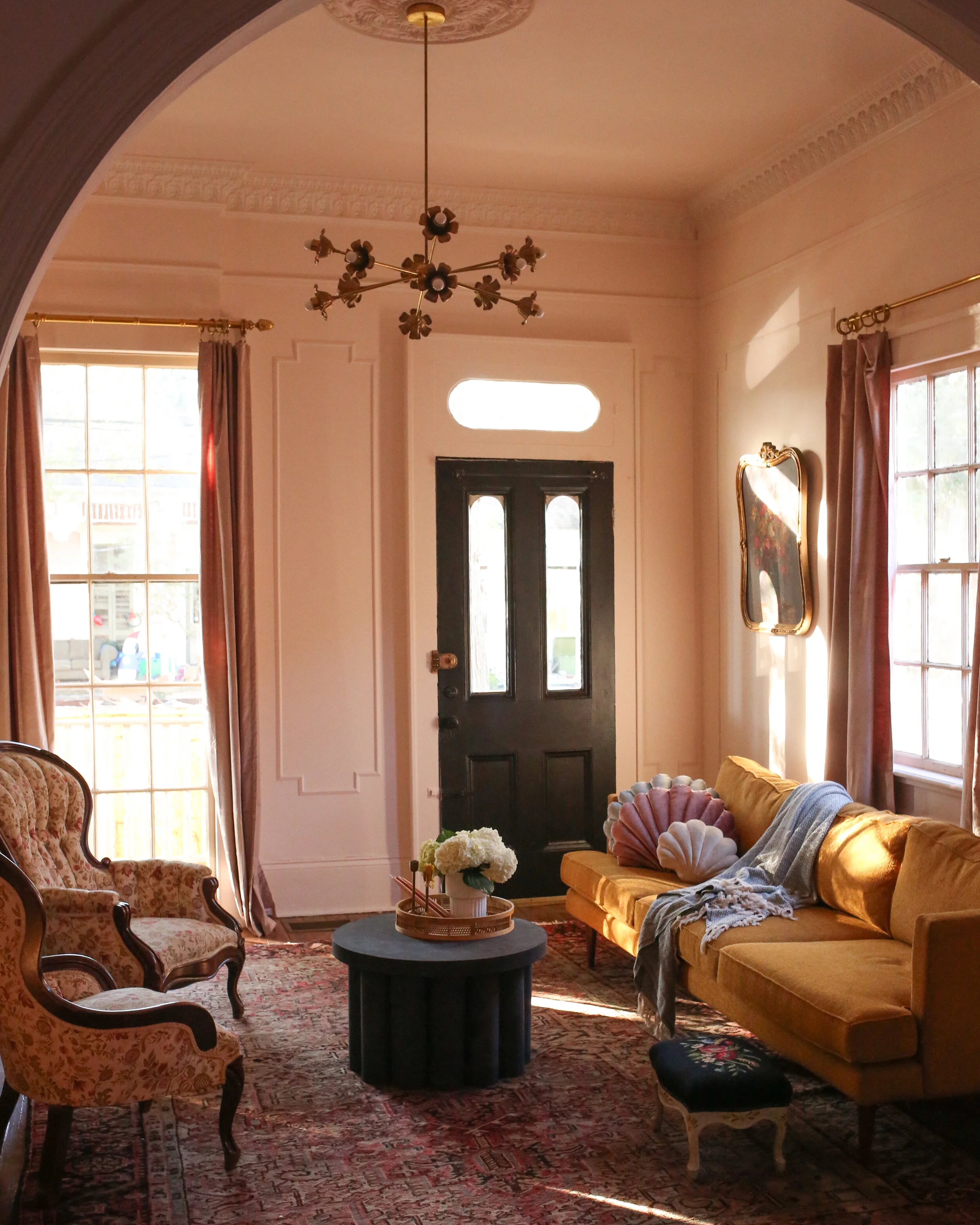
Living Room: After
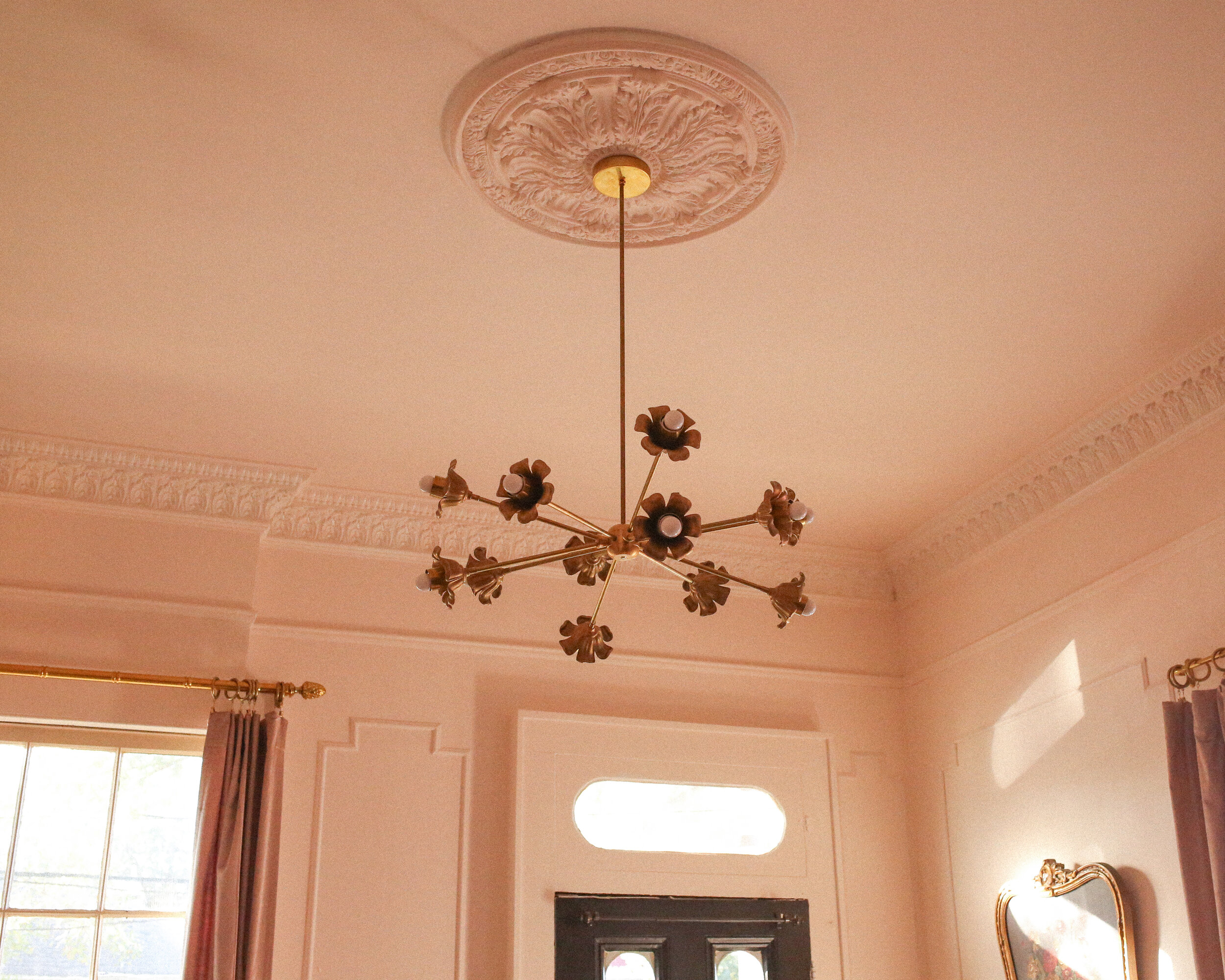
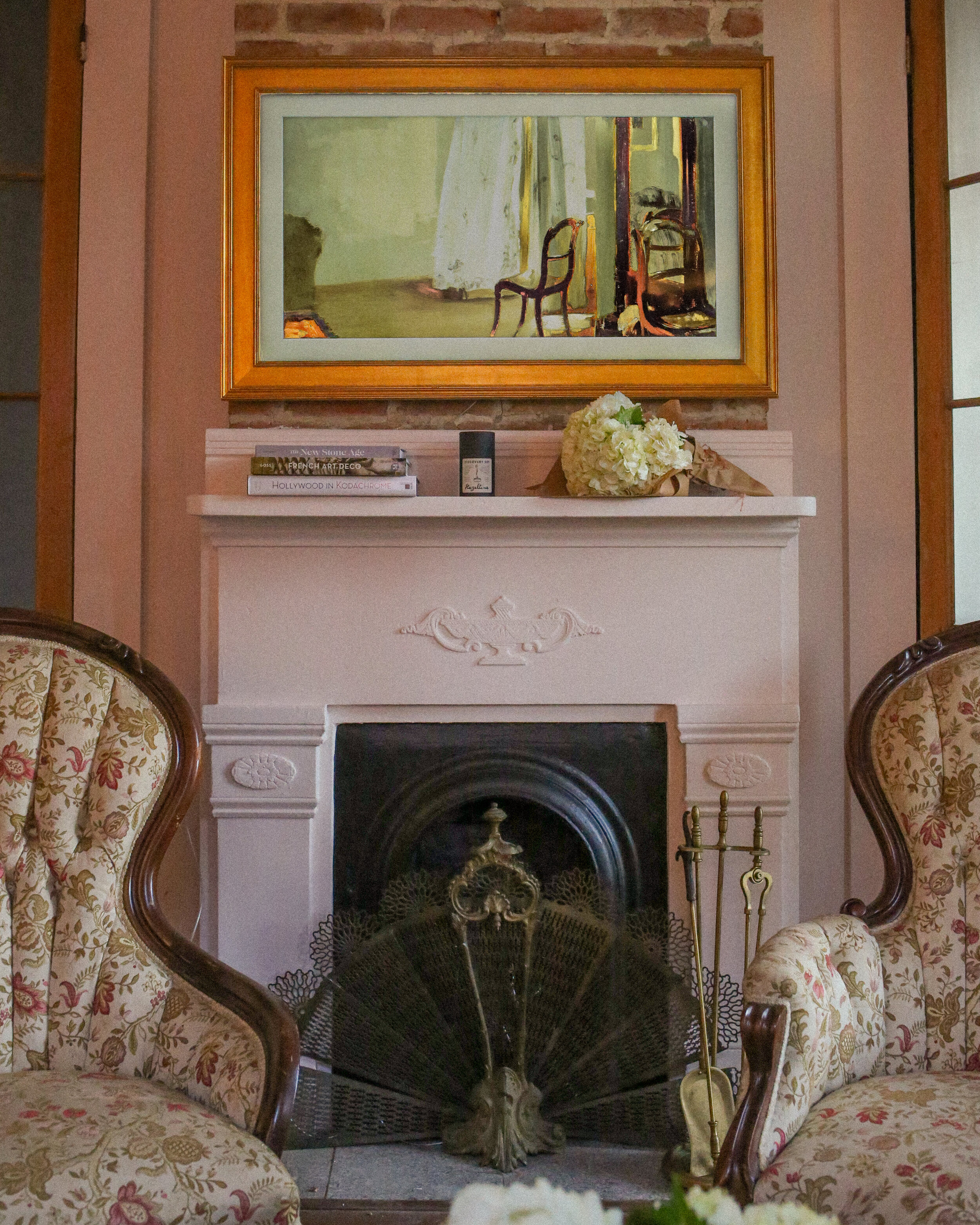
For wall color, I chose Sherwin-Williams Intimate White SW 6322, which is a gorgeous white that has a strong blush undertone. During the day when the room fills up with natural light, it leans a more pure white, but in the evening when there’s a warm glow of the chandelier and lamps it has a warm blush color that I love. To ground the space and add contrast, I used Sherwin-Williams Tricorn Black SW 6258, and I honestly cannot wait to one day paint a whole room this color. It’s one of the most stunning pure blacks I’ve ever used and it works incredibly well on the door and fireplace.
We used the Sherwin-Williams Emerald Designer Edition in flat for the walls of both rooms, which helps hide some of the imperfections of our old walls. The paint went on so nice and smooth, it was incredibly easy to work with and the rich pigmentation of both colors made us so happy. The crown molding and bookshelves both got Sherwin-Williams Emerald Urethane Trim Enamel, which provides a strong barrier to scuffs and damage.
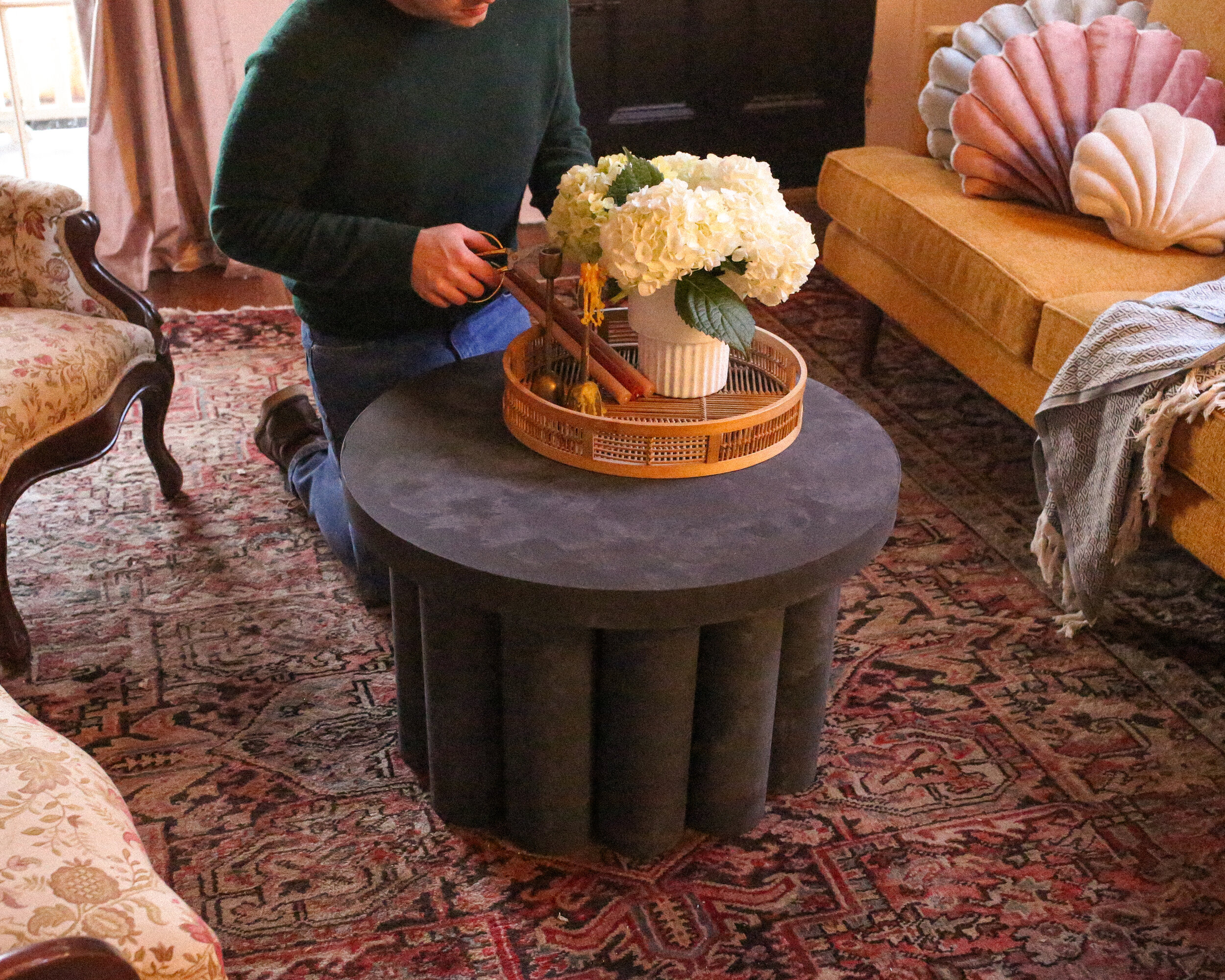
For my DIY element, I made a “stone” coffee table out of a circular cut of wood, PVC, and limewash. I’ll provide the DIY and more info on the process when our lives simmer down a little bit, but I think the end result is really cool and looks way more expensive than a pile of PVC and wood, which is what it is. Another DIY element in both of our rooms is the decorative picture frame molding on the walls, which really help add interest to this room even without much wall art.
The rugs and sitting chairs I used were both vintage finds, and the sofa is the sofa we already had––the result of six months of backorder for the white tufted sofa that is going to really shine in this space, once it finally arrives. I love how the space came out and while there are still a few next steps to making it truly feel complete, it already feels like the perfect entry into the home. I’ll let Matt dive into his office later on in the post, but I gotta say, I love love love how these two rooms work together.
Office “Before” & Design Plan
OFFICE BEFORE
from Matthew
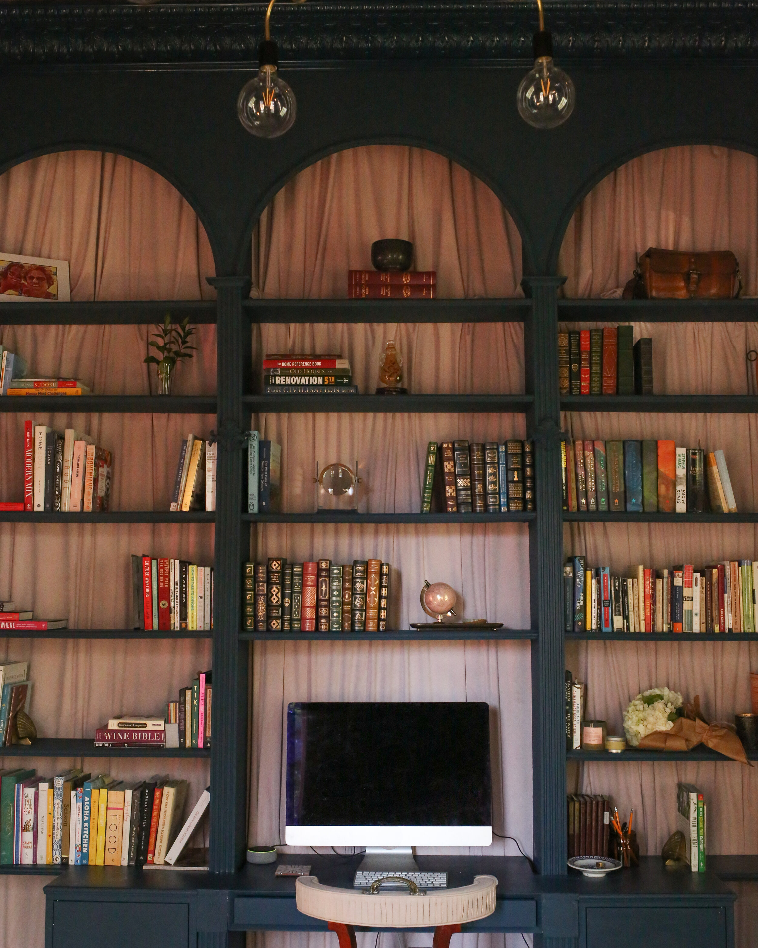
When we walked into this house for the very first time (approximately two hours before making an offer to buy it) I immediately knew this room would make an incredible home office. The previous owners actually used it as their living room, and used the room Beau designed as more of a foyer—we immediately agreed we would like to find a bit more use for both spaces. I was inspired by the placement of their existing bookshelves, but I also wanted to expand and exaggerate them, and to figure out a way to incorporate a desk into them. Since Beau and I work together, from home, this office would definitely need two desks: one as part of the shelves I’d now signed myself up for building, and one in the center of the room facing the front wall of the house. And since a dark blue room has been a dream of mine for years, all of this was going to be drenched in a deep, dark blue that would inspire focus and calm.
Office “After”
This office is top-to-bottom covered in in Rainstorm SW 6230, from the baseboards up to the crown moulding, and I have never been more thrilled with how a paint color has turned out. It’s moody and inspires me to get work done calmly and efficiently. The floor-to-ceiling bookshelf unit I built towers over the room and not only invites you to look through our entire book collection but also leads your sightline up to draw attention to our high ceilings, which in this room I’ve covered with a plum plaid wallpaper. That wallpaper is probably my riskiest design decision ever, but I couldn’t be happier with how it simultaneously gives you a warm hug and reminds you you’ve got some room to breathe in here. I also used Sherwin-Williams Emerald Designer Edition on the walls and Emerald Urethane Trim Enamel and am in love with how the finish came out.
The task of bridging the cold deep blue to the warm purple plaid is left to the blush accents—rippling velvet lining the back of the bookshelves and more blush velvet for the window treatments. One of my favorite things about this entire duel is that Beau and I separately decided on blush as an accent color theme. Maybe we’ve got more in common than we thought when it comes to design taste! But at any rate, what a happy coincidence that really helps the two rooms give off a healthy yin/yang relationship.
Some of my favorite pieces in this room are vintage finds and items with some personal history to them. First off I’m absolutely in love with the pink floral upholstered side chair that I scored at a local consignment shop. It’s a perfectly odd shape and brings just enough feminine energy into this room. Above the mantel I’ve hung a framed photograph of a pair of drag queens celebrating Mardi Gras in the 1980s. The purple outfits they’re wearing punctuate the other accent colors in the room, but it’s also a meaningful piece to me because the photo was taken by a close family friend who passed away a couple years ago. I’ve also got a framed print of an 1883 map of our neighborhood—and you can see our house on it!
While, yes, this is a competition, I could not be more thrilled with how these two rooms contrast and complement each other. I think we’ve created two distinct spaces that are similar enough to be cohesive as adjacent rooms, but different enough to let our personal tastes and their respective distinct uses shine through. So congrats to us, I guess we’re both winners! (spoken as someone who doesn’t like to lose and thinks Beau has a good chance of winning whenever we put this to a vote).
Thank you so much to everyone who has followed along on our journey of fixing up these two spaces. They’ve become each of our most favorite projects, and we hope you’re as happy with the end result as we are! Working with Sherwin-Williams on these spaces has been an absolute dream. Their in-store associates are so knowledgeable and really helped us talk through our ideas for the types of paint and finishes we wanted to use. You can find your neighborhood Sherwin-Williams store here.
We’ve got more spaces coming up with Sherwin-Williams and we can’t wait to show you. Let us know what projects you’re currently working on!
