
DIY Unique Art that Fits Your Home

Unless you’re a serious collector or maybe an artist yourself, you’ve probably had moments when you’re like… “what the hell is art about” or “is this art good or bad” or “is this even art or just a mustard stain.” I definitely have had those thoughts, and I hereby offer this disclaimer that I have literally no experience or training with painting or art theory or any of that stuff. That should become abundantly clear with the following bold attempt to fake my way into art.
The only thing I am good at with art is picking pieces with colors that work for a room. While I’m totally respectful of art and and open to experts explaining art to me, and while I fully would love to buy actually good and valuable pieces of art when we’re old and rich and can afford them, right now I only have the bandwidth (and the budget) to think about art in terms of interior styling. To be clear: if you have the budget for it, support artists and buy art! But what happens when you’re limited by money is you may turn to mass-produced pre-framed prints from big box stores, or you find yourself limited to the eerie paintings of fields that eternally gather dust at thrift stores. And those options aren’t helping anyone out, least of all you.
I’ve got some tips to make (or fake) art that maybe isn’t gonna land you in the MoMA but it’ll be good enough to round out a stylish room.
Materials
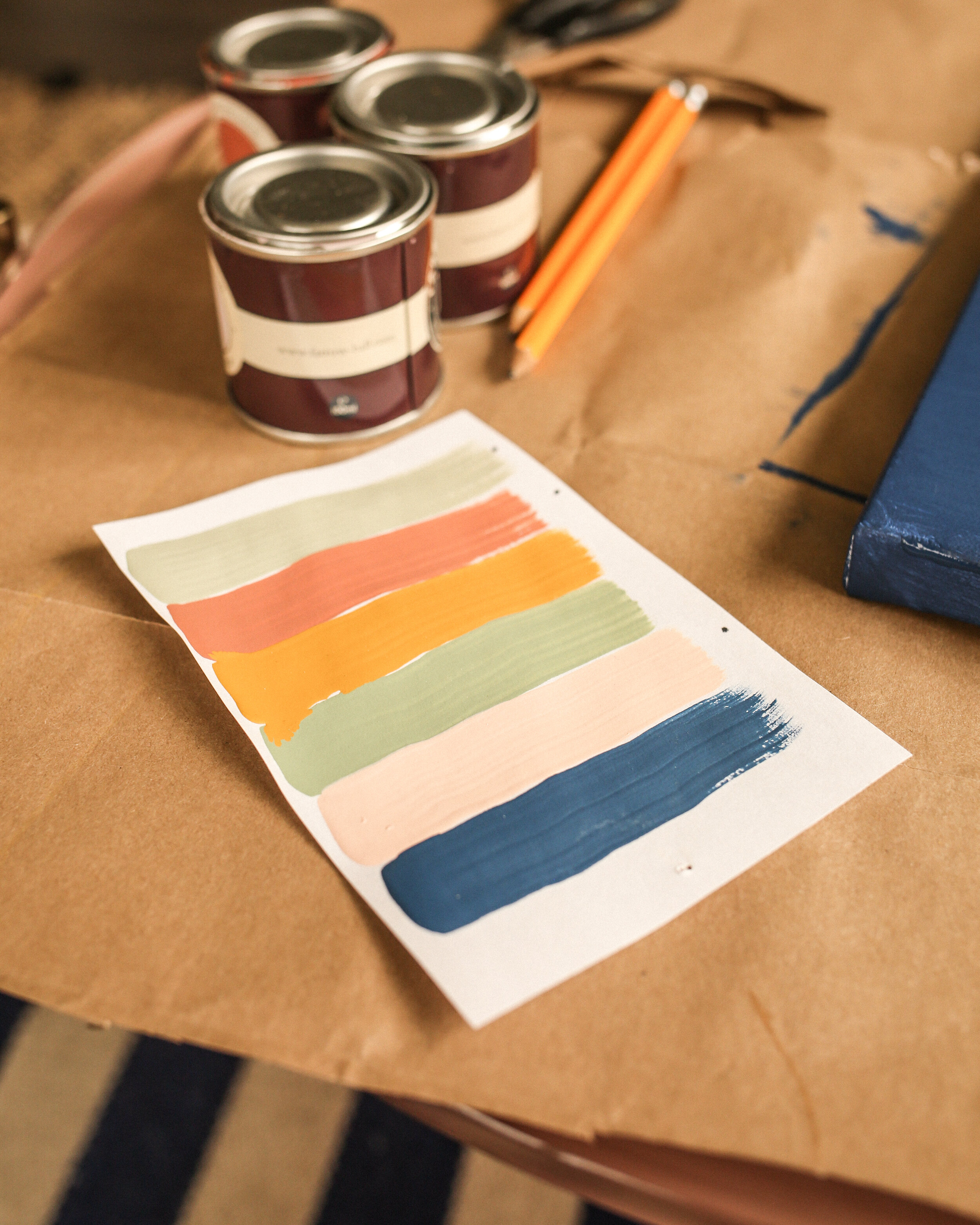
leftover wall paint samples (or, notes on picking out a few new ones from your local home improvement store)
brushes (angled brushes, flat wall paintbrush)
pencil
stretched canvas in whatever size you need
newspaper, painter’s cloth, or some other surface that can get ruined with paint

I imagine I’ve already pissed off any art purists who might be reading this, but if I haven’t I’m about to. Here it goes: I’ve just been using leftover house paint. It’s cheaper than professional acrylic paints that you’d find at an art supply store, and it means I don’t have to waste the many paint samples we’ve accumulated. Sure this means you’ll end up with a product that may not last as long or be in as pristine condition as oil paints or watercolors, but this isn’t the thesis for your M.F.A., we’re just trying to churn out something vaguely cute to fill that one spot in the house that needs something. When you’re just kind of BS-ing your way to a final product, do you really care if it doesn’t have a fine finish? You don’t.
I just picked out a few of my favorite paint samples—from the many many times Beau and I have fought to the death over room colors—that looked really cool together. If you don’t already have the small army of cute paint samples, head over to your closest home improvement store and play around arranging various paint chips until you have 5-7 (or less, or more) colors that you feel look good and would fit the room you’re painting for. P.S. if you’ve never bought house paint before, here’s where you bring the paint chips to the desk clerk and ask for samples—making sure to specify your preferred finish. For finishes your choices will range from matte to high-gloss, with three to five cutely named options (like “eggshell”) depending on the brand. For my specific project, I went with a matte finish for everything except the black, which I got in the glossiest finish available.
For brushes, I found I did okay with four different size brushes. At your typical art supply store you can find individual brushes for sale, and there are usually multiple price ranges to choose from. Go for the cheapest! I found that one straight flat brush for filling in large areas, one slightly fluffy angled brush for painting lines, and a teeny tiny detail brush for the small delicate spaces made a good combo for me. The fourth brush I got was a basic wall paintbrush brush from the paint section at the home improvement store. I used this for my initial painting of the canvas when I wanted a background other than white, or for large sections when the flat brush seemed like it would take too long.
For stretched canvasses, it’s probably obvious, but you can find these at any art supply store or online. Bigger name stores like Michaels will obviously have them, but I prefer a small locally owned store called Mo’s Art Supply (they have three New Orleans metro locations!). Canvasses are always so much more expensive than I expect, but at Mo’s they always have them on sale, I think because these are overstock that they get for cheap? I don’t know, but maybe try checking out your nearest small local art store to see if they do something similar.
Methods
If you’ve got an idea for what you want to do already, don’t let me keep you. Just get to it. There are obviously no rules here, we’re all just adults faking our way into barely-passable art so I think the time for rules has long passed. But if you’re stuck and want some inspo, I have a few thought starter projects that can maybe get your mind moving.
The Blind Contour Method
I have to thank our friend Chris AKA Cubs The Poet for turning me on to this style! A blind contour is a sketching technique where you draw a person or object without taking your eyes off them / the object, and therefore not ever looking at what you’re actually drawing. The subject can be an apple, a person, a horse, or anything really. I used this photo of Lil Nas X.


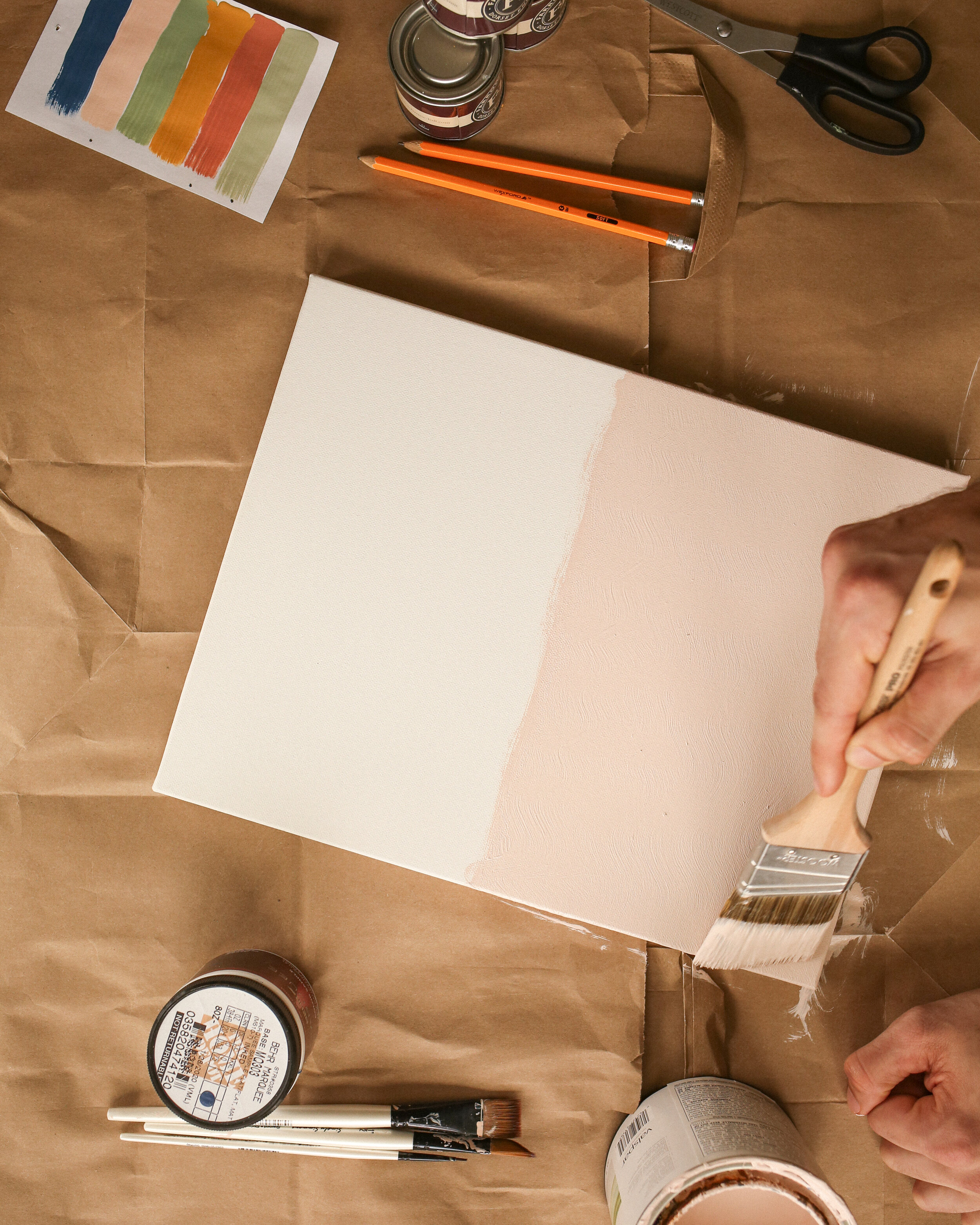
This method is, I think, the coolest of the ones I did, but it’s also the most time consuming. It took me a few days because you’ll need to wait for the stuff to dry at several steps, and your colors may need second coats. That doesn’t mean it’s hard, because it really isn’t! It was actually pretty easy and fun. To start out, I painted the whole canvas green—the same green color from our bedroom actually—including the sides and everything. If you’re keeping just the plain white canvas, obviously skip this step. If not, go ahead and get it painted and then let it dry completely to where you can comfortably and visibly draw on it with a pencil.
Then start drawing your blind contour, in pencil. It doesn’t have to be good. The whole fun of blind contours is that it usually doesn’t look… anything… like what you’re trying to draw. I accidentally drew his jawline twice, put his ear under his eye, and put his nose on his shoulder. I don’t know how a person could be so bad at this, but I am.
When your contour is done, make any changes to the pencil outline that you would like. Maybe the canvas doesn’t look balanced so you add two random circles like I did. Or maybe you didn’t have the pencil down hard enough at one point so you have to go in to fix that. You don’t have to go with exactly what came from your blind contouring session, that can just be a starting point. So make whatever adjustments you feel need to be made.
When the pencil outline is where you want it to be, take black paint (or any other color, I’m not your mom) and with your angled brush, trace your pencil lines. When that’s finished, you’ll have to let this sit and dry again before continuing.
The really fun part is then filling in each of the sections with different colors. Use your flat brush to get the big areas and your detail brush to fill in the tiny corners. Make sure when reusing a brush that you’re washing your brush in running water until it’s clear, then patting it dry before switching to a new color. You may find after all these colors dry, especially if you painted the background a color other than white, that these colors need a second coat. So go ahead and give it that.
Finally, revisit any details for finishing touches. Maybe you painted some pink over the black line in one area, so go back and repaint that. That sort of thing. Then let your masterpiece dry and hang it up somewhere. Congratulations you are artist.
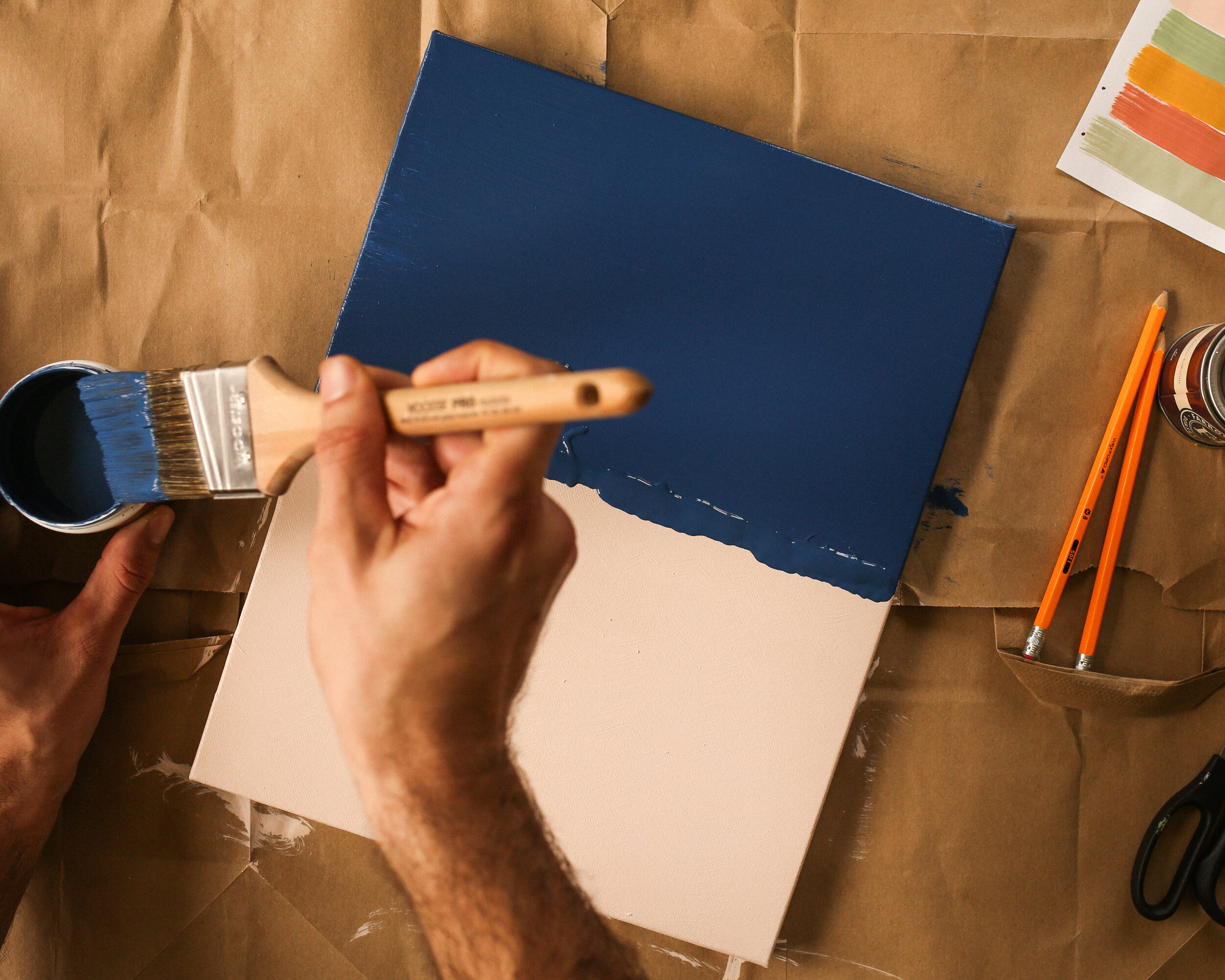
The Two-Tone Drippy Drop

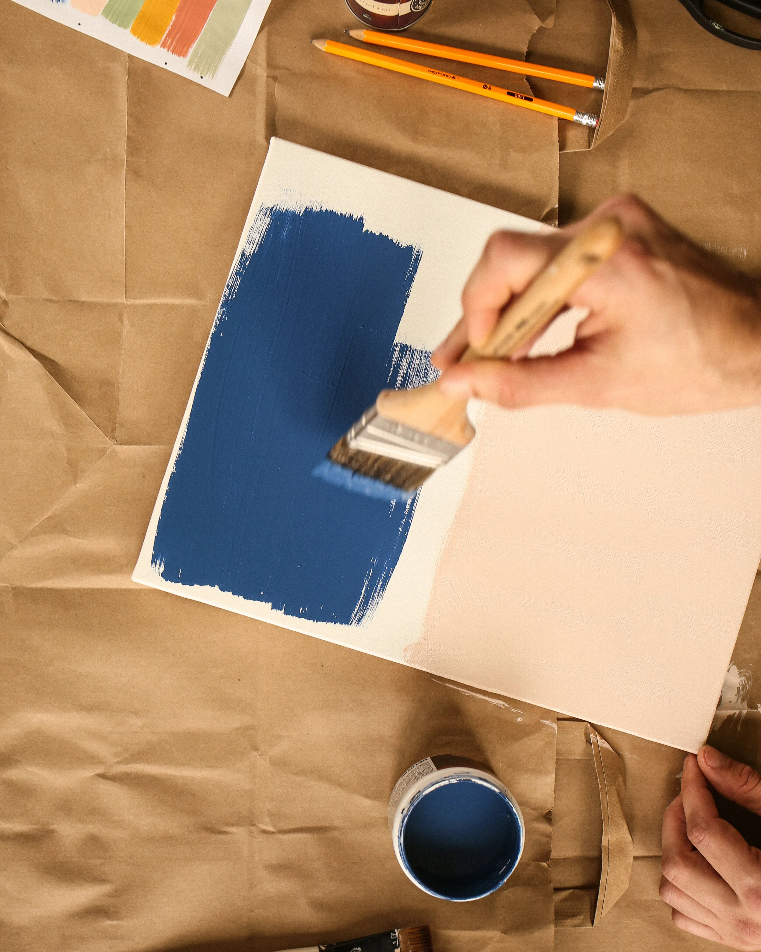
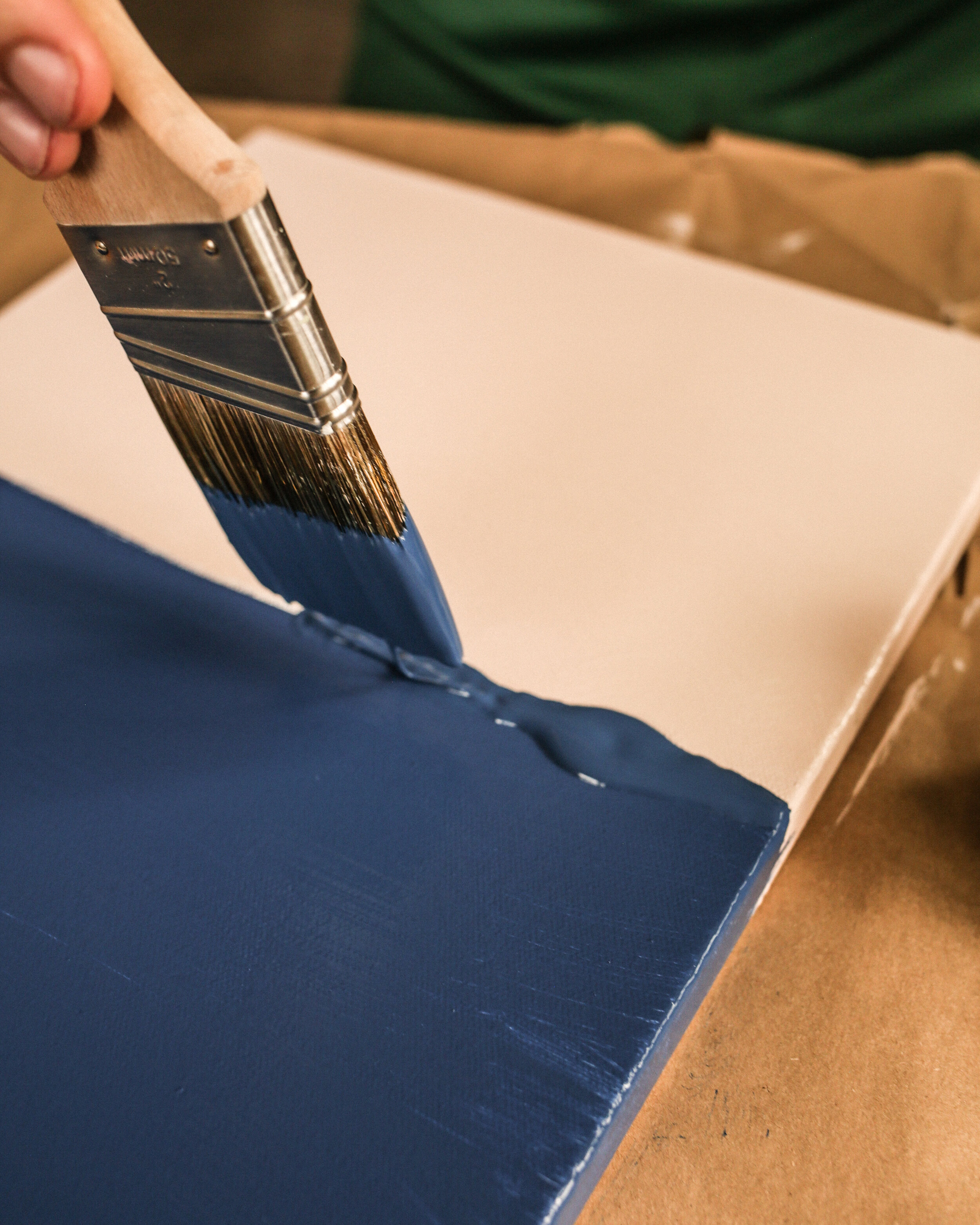
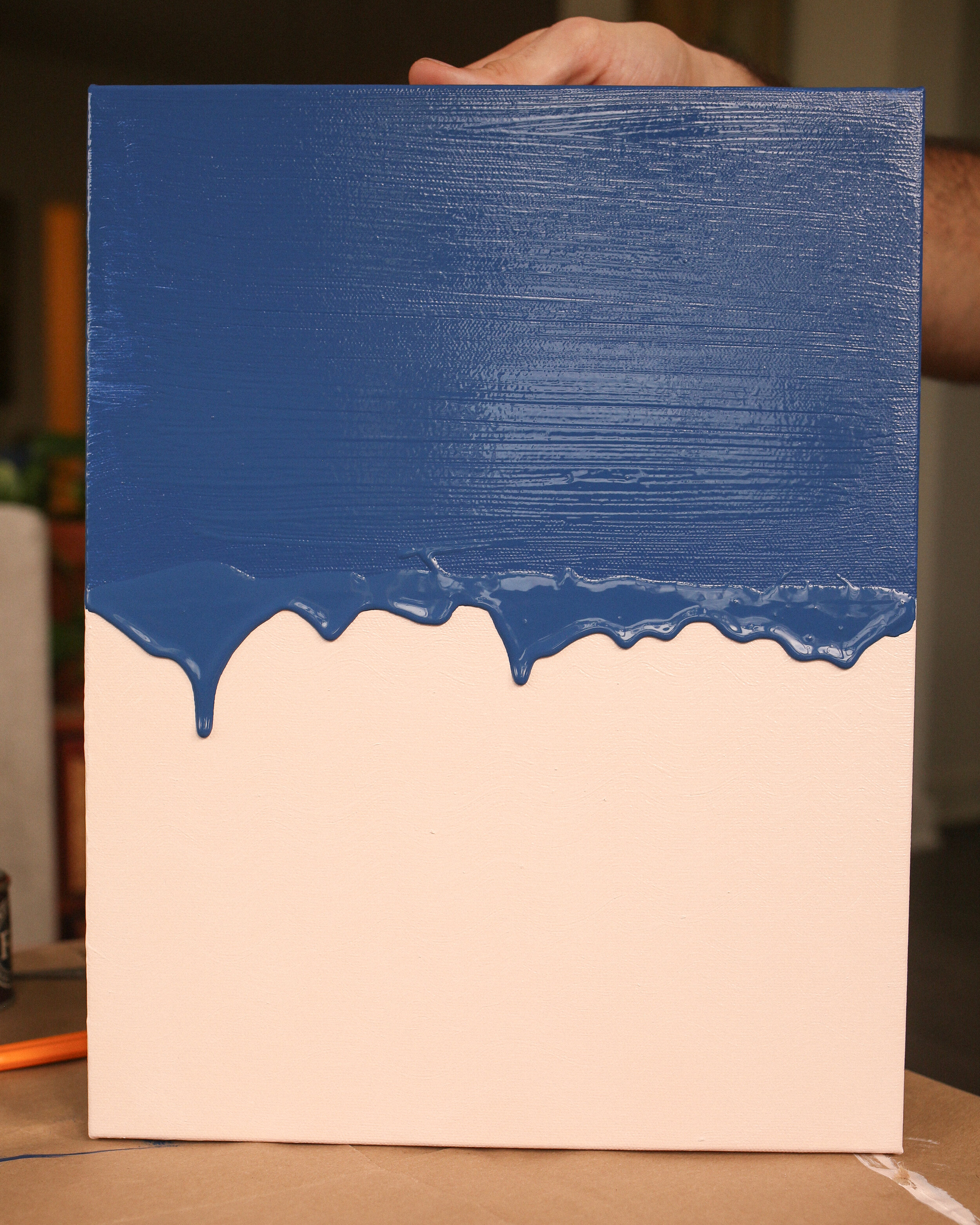
Here’s an even easier one! Pick two colors that go great together, or even that don’t go great together but that you love together. Use the large angled house-painting brush dipped in one color and paint the bottom just-over-half of your canvas. Let that dry and wash the brush. When the paint is dry, use the same brush and paint the other color on the remaining top portion of the canvas. Now take the brush and glob an excess of the second paint color along the border between the two colors. Now turn the canvas upright, leaning it against something if you need to, and let the paint naturally drip down. Keep an eye on it and when it gets to where you don’t want it to drip any further, just put it back down flat so the paint stops running. Let it dry and decide which way is the right way up, because I can’t decide if mine is closeup of a strawberry ice cream cone or a desert landscape on an alien planet. Either way, I’m happy with the result!
One alternative to this idea would be to do more than just two colors. Three, four, or five colors could work pretty much the same way. Just split the sections in three, four, or five instead of in half. As above, paint the first color, let it dry, paint the second color with the excess paint at the border, and raise it up to drip. When the second color has dried completely, repeat for as many colors as you’d like to include.
The Pattern Method

For those of you who like a little bit more order and structure, you can calm down. This one is for you. Using a ruler and pencil, fill your canvas with equally sized squares by drawing vertical and horizontal lines. Then take the ruler at a 45 degree angle and draw diagonal lines across the canvas through the squares, corner to corner, creating rows and rows of interlocking triangles. Now paint these triangles according to some pattern you decide, with either two or four colors according to your preference. Let each color dry before moving onto the next.
You can either leave this piece as a cool multicolored pattern to bring a bold geometric element to a room, or consider letting these colors serve as a background to some other image you create in the center. A cat, a lemon, an ice cream cone? If you don’t trust yourself to sketch and paint an object you can even consider pasting a magazine clipping to the center here, just make sure it works with the color scheme and it’s an illustration rather than a photograph, or your piece will feel more like a collage than a painting. Now you’re a surrealist!
Thanks so much for stopping by the blog today, and if you try any of these ideas out, make sure to tag us on Instagram @probablythis so we can see! :)
xoxo
Matt & Beau

