
Mid-century Pink Dining Room


Pink dining rooms are kind of our * ~ thing ~ * or at least we seem to think if we say that enough times it will just be true? While our current dining room is more of a dining corner than a full room, we stuck to our guns. Because our setup is an open floor plan, we didn’t want to go quite as bold and #dramatic as our previous pink dining room. Remember, the one with the oversized brass chandelier, coral-pink walls, and cayenne dining bench? Ah we loved that one—and how much its brash appearance encouraged raucous wine-fueled dinner parties—but given that our current home requires us to be able to see the dining “room” at all times, we wanted something a bit less…aggressive…but still true to us.
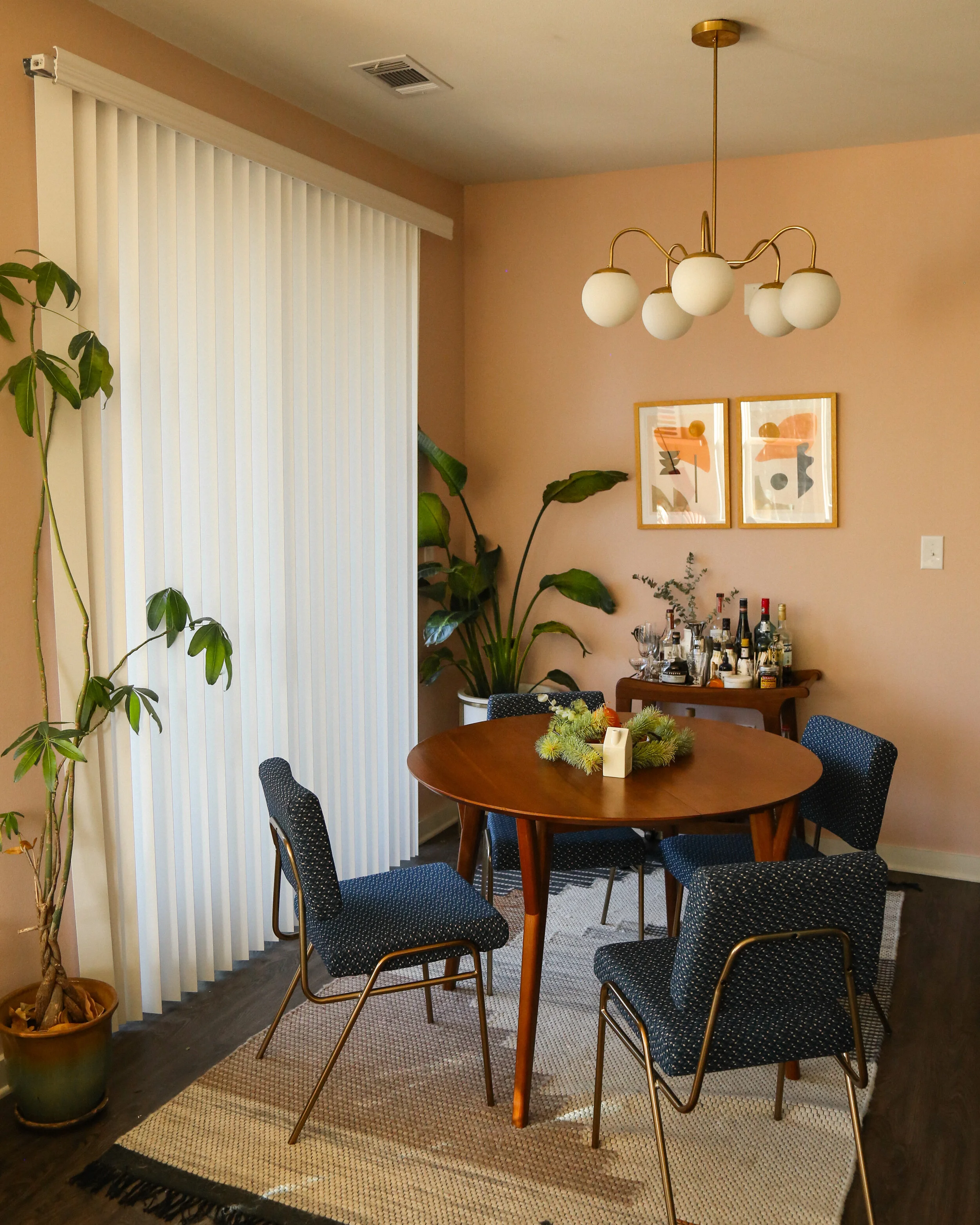
We took our favorite elements from our last dining room—the brass ceiling fixture, pink walls, medium-dark wood, and of course greenery—and downsized and muted them. For this corner, we really wanted to stay in a very strict mid-century modern vibe—with our bolder colorful living room just feet away, this corner needed to contrast enough to be a distinct area while still fitting snugly into the vibe of the full open space. As we usually do when planning out a space, the first step was to create a mood board to make sure Beau and I were on the same page as well as to get an idea for how well all the pieces would fit together. When we make a mood board, we might know some specific pieces we definitely want to include—for those we’ll use product images pulled from that brand’s site. For other pieces, we might just know a general idea of how we’d like it to look, so we do an image search for something ~ kind of like ~ what we want. Here’s the mood board we made for this project:

WALL COLOR
For the walls, we tested out a millions colors, including quite a few remarkably expensive ones from Farrow & Ball (they’re like the Tiffany of wall paints), but didn’t find one that did the job of being fun but muted. Admittedly, the Venn diagram of people who want both of those things in a paint color is probably just us. We finally came across Sherwin William’s pink shadow and, even though the name made me sad because shadow is kind of a creepy word, the color was perfect. It’s gorgeous and changes with the light throughout the day, dancing between cool hued verge-of-purple mornings to warm-hued coral afternoons. We had our color!
CHANDELIER
For the light, we knew we would want something from our friends at Sazerac Stitches in New Orleans. We always use their pieces and we’re always so pleased with how they look in variety of spaces. We went with their Fontainebleau chandelier with white matte globes. To be real, we’re both usually fans of clear globes for a brass pieces, but when we were talking about this part of it, we had one of those shared brain moments where we made eye contact and yelled in unison: “THEY NEED TO BE WHITE!” When looking at the space, those big white globes help create slight color blocking effect by beautifully contrasting against the pink walls. *chef’s kiss*
BAR CART
I honestly bought this bar cart from World Market with the full intention of returning it once we found a nicer piece, but I’ve fallen in love with the simple curved lines and the rich color. It’s also the perfect size for a small space, so for now...shantay you stay, World Market bar cart. You can shop it on the World Market site for about $200.
RUG
We had another very specific rug in mind for this space, which you can see noted above in our mood board. Matt pushed hard the first choice as a bright contrast to the dark floors, but Beau was thinking it would be too loud. That conflict was made a lot easier when we realized the first rug was out of stock. We found another that we both absolutely loved and actually served better as a more muted, neutral base layer to the room.
TABLE
We knew we wanted something small enough to fit in our dining corner without obstructing our access to the balcony, but with a leaf to expand it whenever we had friends come over. Well turns out our friends won’t ever visit us in our small town of Covington, LA, so we go to New Orleans every week for social time and also have a table with a leaf we don’t need. Anyway, love the table! West Elm has a similar one in a rectangular shape if that’s more your vibe, but the circle / oval shape is a great way to add dimension to a space! Shop it on the West Elm site.
CHAIRS
This was the one element of the room we legit could not agree on. Beau wanted something lighter in color and without a pattern, while Matt was all “I NEED THE MORSE DOT CHAIRS I LOVE THEM.” He won and so now we have them and from the moment we opened the box we knew they were IT. The color is gorgeous, especially with the pink wall as the backdrop, and the pattern is so unique.
ART
Beau fell ~in love~ with the art of Jan Skacelik, who does a ton of great abstract shapes with incredible color palettes. As soon as we found his instagram we knew we wanted to hang a diptych of colorful shapes that could pull from the existing colors from the rest of the room. We found Lift Off No. 2 and Lift Off No. 3and knew they’d look incredible against the wall with their block of pink, and also with colors that seemed to be pulled right from our rug and our chairs. Jan’s prints are super affordable (starting at $30) so we grabbed two from him and got them framed locally with a thin, light wood, and a standard 1” white matte.


